CMYK vs. RGB: Choosing the Right Colour Mode for Printing
Selecting the appropriate colour mode for print work is a crucial choice within the design and graphics arena. Regardless of whether your task involves crafting marketing materials, designing business cards, or producing fine art prints, the colours you opt for can greatly influence the final product's quality and vibrancy.
Let's take a closer look at two colour modes: CMYK (Cyan, Magenta, Yellow, Key/Black) and RGB (Red, Green, Blue). These colour schemes play different roles in the design universe, and the key lies in picking the perfect mode for your project.
But why is this choice so crucial? It all boils down to how colours transition from the physical realm to the digital domain.
Understanding CMYK and RGB Colour Modes
When it comes to colours, the choice of colour mode can make or break your project. In the printing world, CMYK takes the spotlight, often known as the "subtractive" colour model. It earns that title because the more colour you add, the deeper the shade, ultimately leading to black.
On the other hand, RGB is the colour mode of choice for anything displayed on screens, such as computer monitors, TVs, and digital cameras. RGB follows the "additive" colour model, where colours come to life by blending different amounts of red, green, and blue light. The more light you add, the closer you get to pure, dazzling white.


Each colour mode has its strengths and weaknesses. CMYK is ideal for projects that will end up in print, thanks to its precise colour reproduction and consistency. However, it has a more limited colour gamut, making it less suitable for projects that require the brightest and most vivid colours, such as web graphics or video games.
RGB, with its extensive gamut and vivid colours, is perfect for digital media, but it falls short when it comes to print accuracy. Using RGB for print can result in dull and inaccurate colours, a common pitfall for designers who overlook the importance of colour mode selection.
Understanding the strengths and weaknesses of CMYK and RGB is the foundation for making the right choice in your design projects.
Importance of Choosing the Right Colour Mode
Selecting the right colour mode is more than just a technical detail; it's a creative and strategic decision. Imagine designing a vibrant logo for your business or a stunning poster for an event. Your choice of colour mode will have a profound effect on the final outcome. If you select the wrong mode, you risk a significant disconnect between your digital vision and the printed reality.

To illustrate the importance of this decision, consider a scenario where a marketing team designs a colourful brochure for an important trade show using RGB colours, as it looked brilliant on the computer screen. However, when printed, the colours turned out dull and washed out. The result was a missed opportunity to make a strong impression on potential clients.
The ramifications of choosing the wrong colour mode go beyond aesthetics. It can impact your brand's reputation, as inconsistent colours can erode brand identity and recognition. Moreover, it can lead to costly reprints and delays in your projects, causing frustration and potentially damaging relationships with clients or customers.
Challenges in Transitioning from RGB to CMYK
One of the most significant challenges designers encounter is the shift from RGB to CMYK. RGB colours are vibrant and often extend beyond the gamut of printable colours in CMYK. This difference can lead to unexpected colour shifts, where the colours you meticulously chose in your digital design look drastically different when printed.
The term "colour gamut" refers to the range of colours that a colour mode can reproduce. RGB has a broader gamut compared to CMYK. When you switch from RGB to CMYK, colours that fall outside the CMYK gamut may get desaturated or altered to fit within the printable range. This is where many designers run into difficulties.
RGB colours are created by adding light, while CMYK colours are subtractive and result from the absorption of ink on paper. This fundamental difference in how colours are produced is why RGB colours may appear more vivid on screen than in print. Understanding this distinction is crucial for designers who want to achieve accurate colour representation in their printed materials and addressing these challenges is essential for a successful design-to-print transition.
Role of RIP Software in Colour Translation
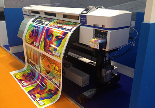
RIP software serves as the bridge between your vibrant RGB digital designs and the world of CMYK printing. It plays a vital role in ensuring that the colours you see on your screen closely match what you get in print. In essence, RIP software is the interpreter that translates your design's digital language into a printable CMYK dialect.
Blackmagic and Megarip offer various colour management tools to ensure the accurate translation of colours. These include colour profiles, colour matching options, and ink limiting settings. By fine-tuning these features, designers can have more control over the colour output, resulting in prints that closely resemble their digital designs.

One of the standout features of RIP software is its ability to create smoother transitions between colours, minimising abrupt shifts that can occur when transitioning from RGB to CMYK. This ensures that gradients and subtle colour variations are faithfully reproduced in print.
Another advantage of RIP software is that it helps maintain colour consistency across different print jobs. This is particularly important for businesses that need to adhere to specific brand colours or want to ensure that a series of printed materials match each other precisely.
By using RIP software, designers can significantly improve the accuracy and predictability of their colour output in print.
Advancements in RGB Printer Drivers
Printer manufacturers have created drivers translating RGB to CMYK for years. The rise of digital file printing popularity prompted the development of RGB printer drivers, marking a valuable addition to the printing landscape.
Before dedicated RGB printer drivers, RGB data required conversion to CMYK prior to printing, introducing colour shifts. RGB drivers solve this by allowing printers to process RGB data directly, bypassing the need for upfront CMYK conversion. This method improves colour accuracy and reduces the risk of shifts.
In an RGB print workflow, the input file is in the RGB colour space. The RIP software translates the RGB colour space of the input file into the RGB gamut accessible to the printer, representing the range of colours it can reproduce. Subsequently, the RIP software transmits the RGB data directly to the printer, which utilises it to produce the final printed image.
The RGB workflow offers several advantages over CMYK. Firstly, it's more efficient as it doesn't necessitate converting the input file to CMYK before printing. Secondly, the RGB workflow can result in more accurate colour output because the RIP software and the printer can work together to take into account the specific characteristics of the printer and the ink being used.
The RGB workflow is a viable option for printing from digital images, especially when using modern printers with advanced colour management capabilities. However, it is important to use the right tools and techniques to achieve accurate colour output.
Best Practices for Using RIP Software
While RIP software offers powerful tools for colour management, it's essential to use it effectively to achieve the best results. Here are some best practices:
- Create and Use Accurate Colour Profiles: Start by creating and using accurate colour profiles for your specific printer and media. This ensures that your prints closely match your digital designs.
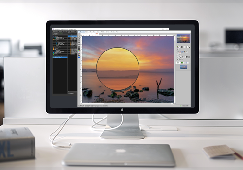
- Calibrate Your Monitor: Monitor calibration is critical for a reliable colour workflow. Regularly calibrating your monitor ensures that what you see on the screen is as close as possible to the final print.
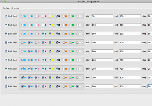
- Understand Ink Limiting: Ink limiting controls the amount of ink applied to the paper. It's crucial for preventing ink saturation and achieving consistent colour reproduction.
- Test and Proof: Before running a large print job, it's a good practice to test and proof your design. This helps identify any colour issues before the final print, saving time and resources.
In a world where first impressions matter, the choice of colour mode in design and printing is a pivotal decision. Accurate colour representation can make or break your project, affecting branding, marketing, art, and more.
Understanding the fundamental differences between CMYK and RGB colour modes is the first step towards achieving colour accuracy and vibrancy in your projects. CMYK excels in the world of print, providing precise colour reproduction and consistency. In contrast, RGB dazzles in the digital domain, with its expansive gamut and vivid hues. The key lies in selecting the right mode for your specific project.
Fortunately, RIP software steps in as the essential bridge, ensuring that what you see on your screen faithfully translates into vivid and accurate prints. By understanding the nuances of colour modes, leveraging RIP software, and following best practices, you can minimise colour-related challenges and consistently achieve your vision in print.