Colour Theory and Its Importance in Printing
In a world awash with visual content, where design and branding play pivotal roles in capturing attention and conveying messages, understanding the science and art of colour is nothing short of essential.
Imagine receiving a brochure with clashing colours or a poster where the blue appears closer to green. Such inconsistencies can significantly diminish the impact of printed materials. This is where colour theory takes centre stage, ensuring the faithful reproduction of envisioned colours on paper.
Colour theory is both the science and art behind understanding how colours interact with each other and how they can be combined to create visually pleasing compositions. It serves as the foundational principle that guides artists, designers, and print professionals in making informed decisions about colour selection, contrast, and harmony.
Understanding Colour Theory
At the heart of colour theory lies the colour wheel. It's a simple, yet powerful tool that helps us categorise and understand colours. The colour wheel is divided into primary, secondary, and tertiary colours.
- Primary colours — red, blue, and yellow — are the building blocks for all other colours.
- Secondary colours — green, orange, and purple — result from mixing two primary colours.
- Tertiary colours come from mixing a primary and a neighbouring secondary colour.


Now, let's get into the nitty-gritty of colour properties:
- Hue refers to the actual colour of an object, like the specific shade of blue.
- Saturation measures how pure a colour is. High saturation means the colour is vivid, while low saturation makes it dull.
- Brightness, on the other hand, refers to how light or dark a colour appears.

Colour theory isn't just about the basics; it's about understanding how colours interact, complement, and create harmony. The colour wheel, and core concepts are the building blocks for your journey into the colourful world of design and printing.
Colour Relationships
Colour relationships are at the core of colour theory. The colour wheel is a powerful tool that helps us understand the relationships between colours.
The colour wheel typically showcases twelve colours, with the primary colours—red, blue, and yellow—spaced evenly around it. One key concept within the colour wheel is complementary colours. These are pairs of colours that sit opposite each other on the wheel. Complementary colours create strong contrasts, for example, red and green, or blue and orange. These pairs make for eye-catching combinations in designs.
On the other hand, analogous colours are neighbours on the colour wheel and blend harmoniously. Think of a sunset with shades of orange, pink, and purple. Analogous colours create a sense of unity and flow in your designs.


Colours can be categorised as warm or cool. Warm colours, like red, orange, and yellow, evoke feelings of energy and excitement. In contrast, cool colours such as blue, green, and purple bring a sense of calm and tranquillity. The choice between warm and cool colours can significantly impact the emotional response your design elicits.
Creating colour harmony is the art of combining colours in a way that's visually pleasing. It's like composing a beautiful symphony of colours. Achieving harmony often involves using the colour wheel and principles like complementary or analogous colours.
Understanding these concepts is a crucial step toward mastering colour theory. It's not just about knowing what colours look good together; it's about knowing why they do.
Colour Models and Printing
Understanding colour theory is pivotal, but it's equally important to grasp how it translates into the world of printing.
Printing relies on different colour models, with two of the most prevalent being RGB (Red, Green, Blue) and CMYK (Cyan, Magenta, Yellow, Key/Black).
RGB, often associated with digital displays, relies on the additive colour model. Here, colours are produced by mixing varying intensities of red, green, and blue light. When these colours combine at full intensity, they create white light. It's the model used in everything from computer monitors to television screens. However, it's essential to note that RGB is not ideal for printing, as it doesn't accurately represent the colours achievable in print.
On the flip side, CMYK is the go-to colour model for printing. It employs the subtractive colour model, where colours are created by subtracting wavelengths of light. In CMYK, cyan, magenta, yellow, and black (the "K" stands for key) inks are combined in varying proportions to produce a spectrum of colours. This model is tailored to the absorption of light on paper and provides more accurate colour representation for printed materials.


So, how does colour theory fit into these models?
RGB relies on the blending of light, and it's essential for digital design. Colour theory here plays a crucial role in creating stunning visuals for websites, presentations, and digital media.
In the CMYK model, colour theory guides the selection of ink and how they blend on paper. It's here where you need to understand how colours mix, how to achieve the right hues, and ensure your design translates beautifully onto a printed page.
Colour Management in Printing
Effective colour management is crucial for achieving accurate and consistent colours in your print designs. It bridges the gap between the digital and physical worlds, ensuring that what you see on your screen matches what appears on paper.
Printers and monitors interpret colours differently, often leading to discrepancies. Calibration is the solution, involving adjustments to settings like brightness, contrast, and colour balance to align digital and printed colours.
Colour profiles are essential, serving as guides for your printer. Think of them as maps that instruct your printer on how to mix ink for the right hue, brightness, and saturation. ICC (International Color Consortium) profiles are vital for consistent colour across devices and applications, acting as translators to ensure consistent interpretation.
In addition to these essential elements of colour management, the use of colour-managed RIP software is also a valuable component of the process. RIP software enhances colour accuracy by optimising the colour data sent to the printer. It interprets and processes the colour information from your design, making adjustments for the printer's specific capabilities and colour space.
For ongoing colour accuracy, it's crucial to regularly calibrate your equipment and use ICC profiles that match your printer and paper. Be mindful of ambient lighting conditions, which can affect how colours appear.
By combining calibration, colour profiles, and colour-managed RIP software, you can ensure the best possible colour accuracy and consistency in your prints. Adhering to industry standards and best practices in colour management ensures professional-quality prints for branding, marketing, or personal projects, helping you achieve the envisioned results.
Challenges and Solutions
While colour theory and management are crucial in the world of printing, they come with their share of challenges. Understanding these challenges and knowing how to address them is essential for designers, print professionals, and anyone aiming for colour perfection.
- Variability in Printing Devices: Different printers, such as inkjet, laser, or offset, may produce slightly different colours due to technology and ink variations. Choice of paper or substrates can also affect colour reproduction.
- Environmental Factors: Lighting conditions, including natural daylight, incandescent, or fluorescent lighting, can alter how colours are perceived. The same design may look different under various lighting conditions.
- Discrepancy Between Screen and Paper: Colours on a computer screen may not always translate accurately onto paper. Variations in monitor quality, colour profiles, and ambient lighting conditions can contribute to discrepancies.
- Colour Shifts During Printing: Differences in printing equipment, ink quality, or paper type can lead to colour shifts during the printing process. Addressing these shifts is fundamental to colour management.
- Colour Gamut Limitations: Modern printers can reproduce a wide range of colours but may fall short in capturing the full spectrum visible to the human eye. Managing these limitations is crucial, especially for projects requiring vibrant and vivid colours.
Solutions:
- Use of Colour Proofs and Correction: Colour proofs, made before the final production run, help identify discrepancies and allow adjustments before the full print job. Calibration and profiling of printers are essential to minimise device-specific colour variations.
- Colour Correction: Adjusting colours to achieve a more accurate and desired output is essential. Tools like Adobe Photoshop and Lightroom are commonly used for colour correction, allowing fine-tuning of images and graphics.
- Precision in Print-Ready Files: Preparing print-ready files with precision includes selecting the appropriate colour space, using the right ICC profiles, and ensuring high-resolution images. These steps prevent unexpected colour variations in the final print.
Navigating these challenges in achieving consistent colours requires a blend of meticulous preparation and flexibility. The world of printing is dynamic, and understanding these variables is crucial for ensuring that your designs look as intended, regardless of the printing device or viewing environment.
Practical Applications
Colour theory isn't a mere theoretical concept; it's a powerful tool that can transform your design and printing projects.
Imagine a marketing brochure or a product label where colour choices were made haphazardly, leading to a lacklustre or even unappealing design. Now, picture the same project after applying colour theory principles. The transformation is striking. The colours pop, the design looks balanced, and the message becomes more engaging.
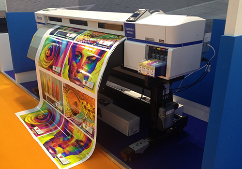
Expanded Gamut Printing: The traditional CMYK model has its limitations when it comes to capturing vibrant and specific colours. Expanded gamut printing, which utilises additional inks beyond the CMYK base, can greatly enhance colour reproduction. This technique allows for a broader range of colours, providing designers with more creative freedom.
Cost Efficiency and Time Savings: Colour theory isn't just about aesthetics; it's also about efficiency. Using spot colours and precise colour management reduces the need for costly reprints and adjustments. When colours are accurately selected and managed, you save both time and resources. In today's fast-paced design and printing environment, this is a significant advantage.
The Psychology of Colour in Printing
Colour goes beyond aesthetics; it taps into our emotions and influences our decision-making. In the world of printing, understanding the psychology of colour is a potent tool for creating designs that resonate with your audience.
Colours evoke specific emotions. Red can express passion and urgency, while blue conveys trust and calm. These associations vary across cultures, so it's crucial to consider the context and your target audience. For example, the use of green may signify health and sustainability in the healthcare or environmental industries.
In the healthcare industry, soft and soothing colours are often chosen to evoke a sense of care and comfort. Contrast this with the hospitality industry, which may opt for warm and inviting colours to create a sense of luxury and relaxation. Understanding these industry-specific preferences is vital in creating effective print materials.
By harnessing the psychology of colour, designers and marketers can tap into the powerful realm of emotions to engage and connect with their audience on a profound level.
Harnessing Colour
It's evident that colour is far more than a mere visual delight; it's a language of emotions, culture, and branding, and it's a science that bridges the digital and physical realms. It serves as the foundation for creating harmony, conveying messages and eliciting emotions. From the colour wheel to the intricacies of colour management, it's a realm where science and art converge.
So, how can you apply this wealth of knowledge? As a designer, marketer, or printing professional, you can:
- Create More Engaging Designs: Harness the emotional power of colours to connect with your audience on a profound level. Make your designs more vibrant and appealing.
- Save Time and Resources: By mastering colour management, you can reduce costly reprints and ensure your designs look the way you intend.
- Stay Informed: In the ever-evolving world of design and printing, staying curious and informed about new technologies and trends is essential. Embrace the possibilities of expanding gamut printing and keep your designs on the cutting edge.
By applying the principles of colour theory and the practical insights you've gained, you're not just creating designs and prints; you're crafting experiences that leave a lasting impact. So, as you embark on your next project, remember that colour isn't just a tool; it's your key to unlocking the world of possibilities in the realm of design and printing.