Special Colour Management and Print Precision with RIP Software
From vibrant marketing materials to stunning photographic prints, the ability to reproduce colours accurately can make or break a project.
Whether you're a graphic designer, a photographer, or a print shop owner, your work relies on colours that look as intended, match brand guidelines, and evoke the desired emotions in viewers. Inaccurate colours can lead to disappointment, missed opportunities, and lost business.
Print precision and colour management are inextricably linked. Precision refers to the ability to reproduce images and colours with sharpness and exactness, while colour management involves the control and maintenance of colour accuracy throughout the entire printing process. The marriage of these two factors ensures that your prints meet or exceed your clients' expectations.
But how can you ensure that your printing projects consistently achieve this high level of colour accuracy and precision? That's where RIP software steps into the picture.
The Role of RIP Software
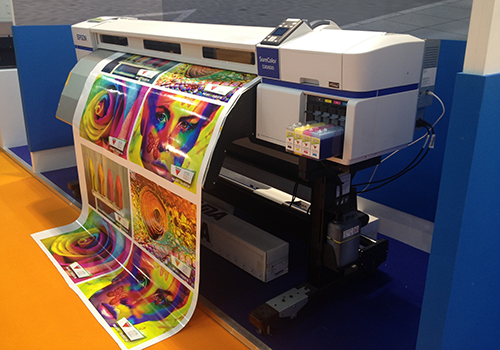
Raster Image Processing (RIP) software’s primary function is to interpret the digital files you send to the printer and translate them into a format that your printer can understand and reproduce accurately. But it goes beyond this fundamental task, playing a central role in ensuring colour consistency and precision.
One of the key functions of RIP software is the management of colour profiles. It helps match the colours in your digital files to the colours your printer can reproduce. This step is essential because different devices, whether it's your computer monitor or your printer, interpret colours differently. RIP software acts as the bridge, ensuring that what you see on your screen is what you get on paper.
RIP software not only manages colour but also streamlines the entire printing process. It reduces the complexity of printing tasks by automating many of the manual steps, resulting in increased efficiency. This means that you can focus on the creative aspects of your work rather than getting bogged down by technical details.
By harnessing the power of RIP software, you can significantly reduce the risk of colour discrepancies and printing errors. This is especially crucial for professionals who deal with large volumes of print jobs, such as commercial print shops, as it helps save time and materials while ensuring consistent, high-quality results.
Special Colours Explained
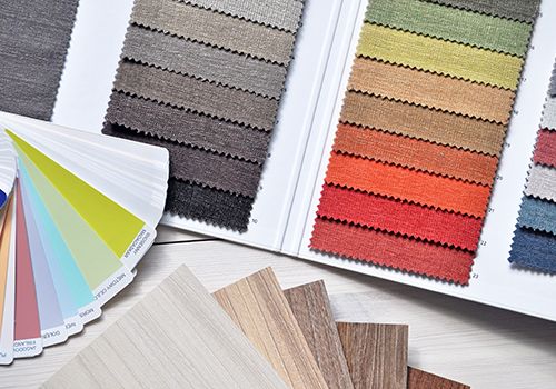
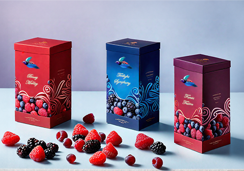
Special colours, commonly referred to as spot colours, encompass a broad spectrum of custom-mixed inks beyond the standard CMYK (Cyan, Magenta, Yellow, and Key/Black) inks. They are used to achieve specific visual effects that cannot be attained with the basic colour palette. By incorporating special colours, designers and printers can achieve a variety of effects, including:
- Metallic finishes: Special metallic inks can create a luxurious and sophisticated look, adding a touch of elegance to branding materials, packaging, and other printed pieces.
- Fluorescent hues: Vibrant fluorescent inks can make printed materials stand out and grab attention, particularly effective for marketing materials and promotional products.
- Subtle pastel tones: Delicate pastel shades can add a touch of softness and refinement to printed pieces, often used for invitations, greeting cards, and other personal stationery.
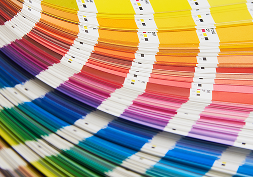
- Pantone Matching System (PMS): Brands often define their colours using the Pantone Matching System, a standardised colour reproduction system. Special colours can be precisely matched to specific Pantone colours, ensuring that brand consistency is maintained across various printed materials.
The use of special colours is a game-changer for designers and printers seeking to create eye-catching, distinctive print materials. Whether you're aiming for a luxurious metallic finish, a vibrant fluorescent hue, or a subtle pastel tone, these specialised colours allow you to achieve effects that elevate your printed pieces to the next level.
Incorporating Special Colours
Special colour sets are employed for a multitude of reasons, each of them contributing to the overall success of a print project.
Some reasons why designers and printers opt for these unique colour palettes include:
- Brand Consistency: Maintaining consistent colours across different branding materials is critical for businesses. Special colour sets ensure that a company's signature colours remain the same, whether they are used on packaging, marketing collateral, or signage.
- Visual Impact: Special colours have the ability to make your print materials stand out. They can convey emotions, capture attention, and leave a lasting impression on the audience. Metallics, for example, can add a touch of luxury, while fluorescent colours can create a vibrant, energetic feel.
- Customisation: Sometimes, standard CMYK inks simply can't achieve the desired colour. Special colours offer a wide range of possibilities, allowing for customised shades that match a client's specific requirements.
- Enhanced Creativity: Special colours open the door to innovative design possibilities. Designers can experiment with unique colour combinations and effects, making their work more visually engaging and memorable.
Special colour sets can turn a good print project into a remarkable one. They add depth, vibrancy, and sophistication to your materials. For example, metallic inks can create a shimmering, eye-catching effect on packaging, making it stand out on the shelf. Fluorescent colours can make event posters and promotional materials impossible to ignore.
Moreover, these colours allow for greater precision in achieving specific hues, which is particularly important when branding colours must be consistent and faithful to the company's identity.
RIP Software's Role in Catering to Special Colour Sets
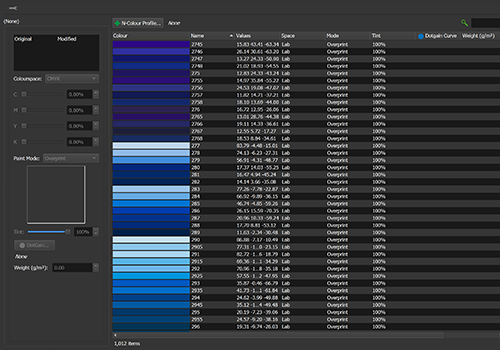
Special Colour Sets, within the context of RIP software, are customised collections of colours created to serve distinct purposes in design and printing. These sets can encompass unique hues, such as corporate branding colours, Pantone equivalents, or custom-mixed inks necessary for a particular project.
Serendipity's Blackmagic software offers an array of tools and functionalities to handle these specialised colour collections effectively:
- Creation and Import: Users can manually create or import special colours from various applications or existing libraries. This flexibility ensures access to a wide range of colour sources.
- Colour Space Flexibility: The software allows special colours to be created in diverse colour spaces, including Lab, CMYK, RGB, or N-colour spaces. This adaptability ensures compatibility with various colour modes based on project requirements.
- Fine Control Over Printing Process: Each colour in the set can have precise ink paint mode settings, dot gain curves, and tint levels. These controls ensure accurate and consistent colour reproduction during printing.
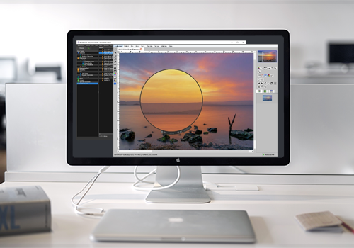
- User Interface and Functionality: The software provides an intuitive user interface, offering a range of options for managing and manipulating special colour sets. This includes features for printing colour lists, matching colours, and presenting colours for soft proofing on-screen.
- Colour Adjustment and Customisation: Users can view, adjust, and customise the colour space values and properties of selected special colours. This capability allows for fine-tuning and matching colours accurately to the intended specifications.
RIP software serves as a comprehensive platform for managing and catering to the demands of special colour sets. Its robust set of tools and functionalities enable designers, print professionals, and colour specialists to work seamlessly with specialised colours, ensuring accuracy, consistency, and vibrant colour output in various printing projects.
Best Practices
While RIP software is a powerful tool for achieving precision and colour management with special colour sets, it's essential to follow best practices to make the most of this technology. Here are some tips to ensure your special colour projects are a resounding success:
Colour Calibration: Regularly calibrate your printer to ensure that it is reproducing special colours accurately. Calibrating your monitor is also crucial to maintain consistency from screen to print.
Colour Testing: Before embarking on a large print run, always conduct colour tests to verify that your special colours match your design intent. This step can save you time and resources in the long run.
Document Your Processes: Keep records of your colour profiles, calibration settings, and testing results. This documentation can be invaluable when you need to reproduce specific colours in the future.
In the intricate world of print precision and colour management, RIP software's ability to manage, calibrate, and store colour profiles, while streamlining printing workflows, is a game-changer. It empowers you to incorporate special colour sets seamlessly, maintaining brand consistency and enhancing visual impact.
So, as you embark on your next print project, remember that with RIP software by your side, precision and colour management are well within your grasp. Elevate your work, captivate your audience, and ensure that your prints consistently impress.