10 Steps to Achieve Precise Photo Prints with RIP Software
In the world of printing, where every hue, shade, and tone matters, achieving accurate colour reproduction is nothing short of an art. Imagine a scenario where you meticulously capture and enhance a photograph, only to have it printed with colours that look nothing like what you envisioned. It's a frustrating and costly experience, and one that can leave you wondering where things went wrong. The culprit? Often, it's inaccurate colour rendering during the printing process.
For photographers intent on preserving the subtleties of their images, the pursuit of exact colour reproduction is a common endeavour. The good news is that achieving this level of colour accuracy is within your grasp, and the key lies in mastering the art of RIP software.
Understanding RIP Software
RIP stands for Raster Image Processor, and it's a specialised software designed to bridge the gap between your digital files and the physical printing process. But what exactly does RIP software do, and why is it crucial in the realm of colour management?
Think of RIP software as the translator that ensures your digital design is interpreted and executed precisely on paper. It takes your digital image files and converts them into a language that your printer can understand. During this translation, it also manages critical aspects of colour, resolution, and ink application.
One of the key responsibilities of RIP software is to interpret colour information and ensure that the colours in your digital file are faithfully reproduced on paper. This is where the magic of colour management begins. Without a reliable RIP software, the colours in your prints may vary widely from what you see on your screen.
Step 1: Calibrating Your Monitor
The journey to perfect prints starts with your screen. Monitor calibration is the initial step in ensuring that what you see on your display is a true representation of the colours that will emerge on your printed materials. Inaccurate monitor settings can lead to a cascade of colour problems down the line.
Calibrating your monitor involves adjusting various settings to match industry-standard colour parameters. It ensures that your screen displays colours consistently and accurately. This process is especially vital for designers, photographers, and anyone involved in creating digital content for print.
To calibrate your monitor effectively, you'll need calibration hardware and software. You can often find calibration tools within RIP software to aid in this process. These tools help you fine-tune brightness, contrast, and colour temperature to conform to established standards like sRGB or AdobeRGB. Additionally, they ensure that your screen's gamma curve aligns with the intended colour response.
Here's a practical guide to calibrating your monitor:
- Choose Calibration Tools: Start by selecting a reliable monitor calibration tool or kit. These often include a spectrophotometer and calibration software. Some RIP software solutions even offer built-in monitor calibration features.
- Set Up Controlled Lighting: Ensure your workspace is under consistent lighting conditions, preferably with neutral white light around 5000K. Avoid direct sunlight, as it can introduce colour shifts.
- Install and Launch Calibration Software: Install the provided software and follow the on-screen instructions. It will guide you through the calibration process. Some RIP software packages include calibration features that can work in tandem with external calibration tools.
- Adjust Display Settings: Make any necessary adjustments to your monitor's brightness, contrast, gamma, and colour temperature to align them with industry standards.
- Create a Profile: The calibration software, whether within your RIP software or a standalone tool, will generate a unique colour profile for your monitor. This profile corrects colour inaccuracies, ensuring that what you see on-screen matches industry-standard colour parameters.
- Regular Recalibration: Monitor calibration is not a one-time task. Periodically recalibrate your monitor to account for any drift in colour accuracy.
By following these steps and taking advantage of the tools provided by your RIP software, you'll ensure that your monitor displays colours consistently and accurately. This sets the stage for the precise colour representation that's essential for achieving perfect prints.
Step 2: Choosing the Right Colour Profiles
Selecting the right colour profiles is a critical step in your journey to achieve the best colour accuracy when printing your photos. The choice of colour profiles ensures that the vivid, lifelike colours you capture in your images translate faithfully to your prints. RIP software offers valuable tools to help you make informed decisions in this regard.
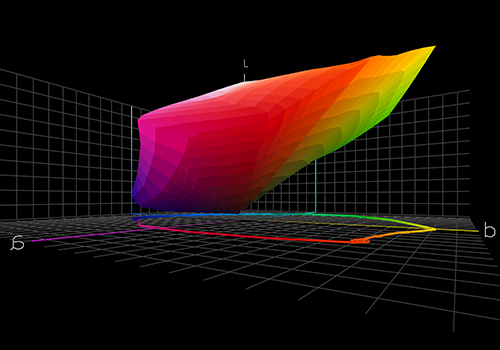
When preparing photos for printing, two commonly used colour profiles come into play: sRGB and AdobeRGB. Each serves a specific purpose and can significantly impact the final result.
- sRGB: This colour profile, designed for web and general-purpose printing, is a smaller colour space. It's suitable for images intended for online display, as it's more consistent with typical computer monitors. When printing photos meant for web use, sRGB can be a reliable choice.
- AdobeRGB: If your goal is to create high-quality prints with a broader range of colours, AdobeRGB is the better choice. It has a larger gamut, making it an ideal option for professional photography and top-notch printing. When you want your prints to showcase the full spectrum of colours, AdobeRGB is your ally.
Your RIP software can facilitate the process by guiding you through the selection and implementation of these colour profiles:
- 1. Profile Selection: Choose the appropriate colour profile based on your intended use and the capabilities of your printer within the RIP software's interface.
- 2. Profile Matching: RIP software often includes features that help match colour profiles throughout your workflow, ensuring that the colours in your photos are accurately reproduced.
By mastering the use of these tools within your RIP software, you can make informed choices about the colour profiles that will yield the best results for your photos. These choices are pivotal in ensuring that your photographic creations transform into prints that captivate with true-to-life, vibrant colours.
Step 3: Consistent Lighting Conditions
When it comes to accurate colour perception, lighting conditions can't be overlooked. The human eye's ability to perceive colours is highly dependent on the quality and consistency of the lighting in the viewing environment.
To achieve colour precision, it's crucial to establish and maintain controlled lighting conditions. Inconsistent or sub optimal lighting can lead to the illusion of colour variations, making it challenging to assess your prints accurately.
Here are a few tips for creating a controlled lighting environment:
- Use Neutral Light: Opt for neutral white light sources (around 5000K) as they provide the most accurate colour representation.
- Avoid Direct Sunlight: Sunlight changes throughout the day and can introduce unwanted colour shifts.
- Consistent Illumination: Ensure even and consistent lighting across your workspace.
- Check for Glare: Minimise glare on your monitor and prints, as it can affect colour perception.
By adhering to these guidelines, you'll set the stage for precise colour evaluation. Consistent lighting conditions serve as a foundation for your colour management efforts, ensuring that what you see under controlled lighting matches what you get in your final prints.
Step 4: Colour Management Tools
As we explore the world of colour precision, we encounter a treasure trove of colour management tools within RIP software. These tools serve as your arsenal for making precise colour adjustments and ensuring your prints meet your expectations.
RIP software offers a range of features to help you achieve optimal colour accuracy:
- Colour Management Settings: Most RIP software provides extensive colour management settings that enable you to adjust colour rendering intent and colour spaces. These settings help you fine-tune colour reproduction to match your preferences.
- Ink Limit Control: Managing ink usage is vital to prevent colour inaccuracies. RIP software allows you to control ink limits, avoiding over-saturation and colour shifts.
- Black Point Compensation: This tool helps maintain shadow detail and tonal range, critical for accurate colour reproduction.
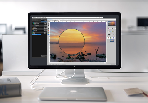
- Soft Proofing: Preview how your prints will look on your screen before sending them to the printer, minimising surprises.
To wield these tools effectively, it's essential to understand their functions and how to apply them to your specific print job. RIP software empowers you to fine-tune colours with precision, giving you control over the final output.
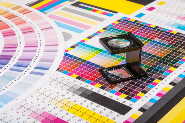
Step 5: Using ICC Profiles
ICC (International Color Consortium) profiles are essential elements in the world of colour management. These profiles define the colour characteristics of devices such as monitors, printers, and digital cameras. Using ICC profiles ensures that colours are accurately translated across different devices and applications.
ICC profiles act as a common language for colour interpretation. They provide a standard framework for consistent colour reproduction, facilitating the exchange of colour data between various devices in your printing workflow.
To integrate ICC profiles effectively into your process:
- Profile Selection: Choose the appropriate ICC profiles for your monitor, RIP software, and printer to ensure consistent colour representation. Standard profiles are available for various paper types, but for custom media, you may need to create your own profiles.
- Profile Conversion: Utilise RIP software not only to select profiles but also to convert colour data from one profile to another. This step ensures that the colours you see on your screen match the final print, even when using non-standard paper or media types.
- Soft Proofing: Employ soft proofing to preview how your prints will look under the selected ICC profile, allowing you to make necessary adjustments before printing.
For custom media or paper types, creating unique ICC profiles can be a valuable endeavour. These profiles account for the specific colour characteristics of your chosen paper, ensuring that your prints faithfully represent your artistic vision. Some RIP software solutions offer tools and guidance for creating custom media profiles, which can be particularly useful for professionals who require precise colour control.
Using ICC profiles, whether standard or custom, is a fundamental step in maintaining colour consistency throughout your workflow, from screen to print.
Step 6: Proper File Preparation
Once you've addressed the crucial aspects of monitor calibration, colour profiles, and ICC profiles, the next step toward perfect prints involves preparing your digital files meticulously. Proper file preparation ensures that your digital creations are ready for optimal colour reproduction on paper.

Consider the following key factors when preparing your digital files:
- Resolution: Set your file's resolution to match your printing requirements. A higher resolution ensures fine details, but remember that excessively large files can slow down your RIP software and printer.
- Colour Spaces: Ensure your files are in the appropriate colour space (e.g., sRGB or AdobeRGB) to match your project's colour requirements.
- File Format: Choose file formats that preserve colour information, such as TIFF or PSD, for the best results.
- Embedded Profiles: If your application allows, make sure that your files have embedded ICC profiles to maintain colour consistency across different devices.
By adhering to these file preparation guidelines, you set the stage for successful colour reproduction. Your digital files become a solid foundation for achieving the perfect prints you envision.
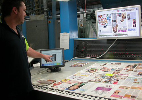
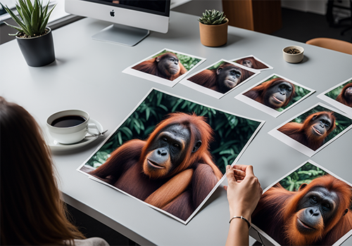
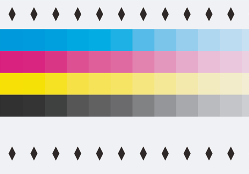
Step 7: Test Printing and Proofing
Before committing to a full print run, it's wise to embark on a critical step in the pursuit of colour accuracy: test printing and proofing. This process allows you to evaluate and fine-tune your colours and settings, ensuring that your final prints meet your expectations.
Effective test printing and proofing involve the following steps:
- Create Test Prints: Begin by producing small, representative prints of your project to assess colour accuracy and overall appearance.
- Evaluate the Results: Examine these test prints under controlled lighting conditions. Pay attention to colour variations, saturation, and detail.
- Adjust as Needed: If you spot any discrepancies, return to your digital file or RIP software settings and make the necessary adjustments.
- Repeat as Necessary: Continue the cycle of test printing, evaluation, and adjustment until you achieve the desired colour accuracy.
- Produce Final Output: Once satisfied with the test prints, proceed to create the final output for your print job.
Test printing and proofing are invaluable in identifying and rectifying any colour issues before they become costly errors in a full production run. This step gives you the opportunity to fine-tune your colour settings and achieve the precise results you aim for.
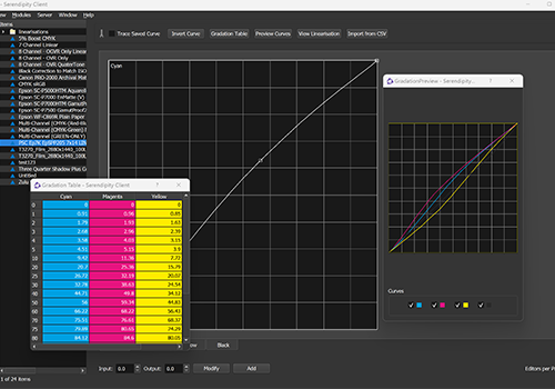
Step 8: Colour Correction Techniques in RIP Software
Colour correction techniques are essential for fine-tuning and perfecting the colours in your prints, and you can apply these adjustments within your RIP software. While some RIP software may not offer traditional settings like saturation changes or brightness and contrast adjustments, it provides specialised tools for achieving precise colour correction:
- Custom Colour Profiles: Create or import custom colour profiles within RIP software to tailor colour reproduction to your specific needs.
- Gamut Mapping: Some RIP software offers gamut mapping tools to adjust colours that are out of gamut (not reproducible) on your output device, ensuring smoother transitions and more accurate rendering.
- Gradation Adjustments: Fine-tune colour gradients to ensure smooth transitions between colours and shades in your prints.
Additionally, you can utilise your design software to make adjustments that RIP software may not handle, such as contrast, brightness, and other artistic enhancements. These pre-RIP adjustments in your design software allow you to achieve the desired look and feel of your prints before they reach the RIP.
By leveraging these design and RIP software tools effectively, you can address discrepancies between your desired colours and the actual output. Mastering these techniques is key to ensuring that your prints faithfully represent your creative vision.
Step 9: Regular Maintenance
Just as a finely tuned instrument requires regular maintenance to perform at its best, your colour management setup demands ongoing care to maintain consistent colour accuracy.
Regular maintenance tasks include:
- Monitor Recalibration: Over time, your monitor's colour accuracy may drift. Recalibrating your monitor at regular intervals ensures that it continues to display colours faithfully.
- Profile Updates: Keep your ICC profiles up to date, especially if you've changed your printer, ink, or paper. Updated profiles help maintain colour consistency.
- RIP Software Updates: Check for software updates or patches from your RIP software provider. These updates often include improvements to colour rendering.
- Printer Maintenance: Maintain your printer in optimal condition by cleaning printheads, ensuring proper ink flow, and replacing components as needed.
- Colour Check and Validation: Periodically perform colour checks and validations to ensure that your colour management system is operating correctly.
Regular maintenance not only preserves colour accuracy but also safeguards against costly mistakes and reprints due to inaccurate colours. It's a proactive step in maintaining your colour management system's reliability.
Step 10: Collaboration and Feedback
The journey to colour precision isn't one you need to undertake alone. Collaboration and feedback are invaluable components in your quest for perfect prints.

Effective communication with clients, colleagues, and collaborators ensures that everyone shares a common understanding of the desired colours and outcomes. Here's how to leverage collaboration and feedback for optimal colour management:
- Client Input: Engage in a dialogue with your clients to understand their expectations and requirements for colour accuracy. Keep them informed about your colour management process.
- Collaborative Proofing: Share proofs with clients or colleagues to gather feedback before finalising a print job. This step minimises surprises and aligns expectations.
- Collect Feedback: Act on feedback received during the proofing process. Make necessary adjustments based on input to achieve the desired colour precision.
- Iterative Process: Understand that colour management can be an iterative process. Continuously gather feedback, adjust settings, and refine your approach to meet evolving needs.
Collaboration and feedback enhance transparency and help you bridge the gap between your creative vision and the final prints. By involving clients and collaborators in the colour management process, you can achieve a shared understanding of colour accuracy and deliver results that meet or exceed expectations.
By following these steps and making informed choices at every stage of your workflow, you can unlock the power of RIP software to ensure that your prints faithfully represent your creative vision.
Remember, colour accuracy is not a one-time achievement but an ongoing commitment. Regular maintenance and collaboration are the cornerstones of a colour management process that delivers precise prints time and time again.