Beyond Pixels: Exploring Colour Rendering Intent
Colour constitutes a foundational element of our visual world, influencing our perceptions, emotions, and choices. In the realm of digital media and technology, the precise portrayal of colour holds exceptional significance. This is where the concept of colour rendering intent steps into the spotlight.
Colour rendering intent, often abbreviated as Rendering Intent, outlines the strategy that a device or software should adopt when translating colours from one colour space to another, ensuring the most authentic representation achievable.
The importance of comprehending and implementing colour rendering intent cannot be emphasised enough. It exerts its influence across diverse industries, ranging from graphic design and photography to web development and video production. Whether you're in the process of crafting a brand logo, editing a photograph, or streaming content on your devices, colour rendering intent silently operates behind the scenes, impacting what you perceive.
What is Colour Rendering Intent?
Colour rendering intent is the set of rules that dictate how colours are converted from one colour space to another. It determines how colours are mapped to the available gamut and how out-of-gamut colours are handled. Understanding the different rendering intents and choosing the right one is vital for achieving the desired colour results in various applications.

There are four primary types of colour rendering intents, each with its purpose:
- Perceptual: Prioritises the overall visual appearance of colours, adjusting the entire colour gamut to fit within the destination colour space while preserving the perceived relationships between colours.
- Relative Colourimetric: Maps the white point of the source colour space to the white point of the destination colour space. Colours that fall within the gamut of the destination space remain unchanged. Out-of-gamut colours are shifted to the nearest reproducible colour within the destination gamut.
- Absolute Colourimetric: The white point of the source colour space is mapped directly to the white point of the destination colour space. Colours that fall within the gamut of the destination space remain unchanged. However, out-of-gamut colours are clipped to the closest reproducible colour within the destination gamut, potentially leading to a loss of detail in highly saturated colours.
- Saturation: Adjusts the saturation levels of colours to fit within the gamut of the destination colour space. Colours that are out of gamut are modified to be more or less saturated, depending on their position in the colour space. The aim is to achieve a visually pleasing result by emphasising the overall intensity of colours.
To execute rendering intents effectively, colour profiles are used. These profiles define how colours are represented and displayed by a specific device. They serve as the bridge between the colour spaces of source and destination, ensuring a seamless translation of colour information. For instance, if the perceptual rendering intent is chosen, the colour profile provides the necessary data for the software to adjust the entire colour gamut while preserving the perceived relationships between colours.
Exploring Colour Rendering
Colour rendering is heavily influenced by the concept of colour spaces. These spaces define how colours are organised and represented. Common colour spaces include RGB (Red, Green, Blue), CMYK (Cyan, Magenta, Yellow, Key/Black), and LAB. Each space serves specific purposes, and understanding their properties is crucial for accurate colour translation.
Additionally, every device or medium has its own colour gamut, which represents the range of colours it can reproduce accurately. Colour rendering often involves mapping colours from one gamut to another, which can be a complex task.
Colour rendering is subject to scientific standards, and the Commission Internationale de l'Eclairage (CIE) plays a central role in establishing these standards. CIE defines parameters like illuminants, observers, and colour spaces, ensuring consistency and accuracy in colour representation across various industries.
Understanding colour models is fundamental to grasping colour rendering. RGB is commonly used for digital displays, while CMYK is essential for printing. LAB, a perceptually uniform colour space, is used for colour correction and management. Each model has its own set of challenges and benefits, and choosing the right one depends on the specific use case.
Applications and Use Cases
Colour rendering is the backbone of a wide range of industries and applications, each with its unique requirements and challenges.
Graphic Design and Printing: For graphic designers and print professionals, achieving accurate colour representation is crucial. Whether it's designing a company logo, packaging, or promotional materials, understanding colour rendering intent is essential for maintaining brand consistency and delivering visually appealing designs.

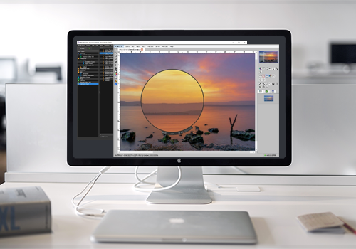
Photography and Image Editing: Photographers and image editors rely on precise colour rendering to ensure their photographs and digital artwork look as intended. From adjusting colours in post-production to printing high-quality images, colour rendering plays a significant role in this field.
Web and Digital Media: The web and digital media industries require consistency in colour representation across various devices and platforms. From creating web graphics to optimising images for online use, understanding colour rendering is essential to deliver a cohesive and engaging user experience.
In each of these fields, colour rendering intent influences the choice of rendering method, colour profiles, and colour spaces, all to ensure that the final output matches the original vision.
Challenges in Colour Rendering
Colour rendering poses several challenges that significantly impact the accuracy and consistency of colour reproduction. These challenges include:
Device Variability and Colour Consistency Across Platforms:
- Challenge: Different monitors, printers, and cameras may interpret and reproduce colours differently. This variability can lead to discrepancies in colour appearance across various devices. What looks great on a high-end monitor might appear differently on a mobile phone or in printed materials.
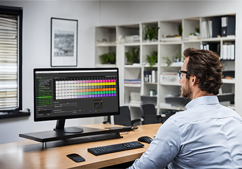
- Solution: To address this challenge, colour management systems (CMS) are crucial. CMS allows for the calibration and profiling of devices, ensuring that colours are reproduced as accurately as possible. Regular calibration of devices and using standardised colour profiles help maintain colour consistency across platforms.
Colour Perception and Subjectivity:
- Challenge: Colour perception varies among individuals and is influenced by factors such as lighting conditions, surrounding colours, and individual preferences. This subjectivity adds complexity to rendering, as what one person sees as an accurate representation, another might perceive differently.
- Solution: To account for variations in perception and subjectivity, it's essential to work with colour standards and colour spaces. Using widely accepted colour models like sRGB, Adobe RGB, Fogra39, and GRACol can help ensure that colours are defined consistently.
Colour Matching and Reproduction:
- Challenge: Achieving accurate colour matching and reproduction, especially when dealing with a wide range of colours and materials, can be challenging. Different materials and printing processes may not reproduce colours faithfully.
- Solution: Colour profiling and colour calibration are again key solutions. When working with printed materials, it's important to use colour profiles that are specific to the printing process and materials being used. Colour proofing and testing can help verify that the desired colours are accurately reproduced. When it comes to digital design, understanding the limitations of the digital colour gamut and choosing colours that are reproducible on various devices can aid in more accurate colour rendering.
Colour Consistency Over Time:
- Challenge: Over time, devices and materials may degrade or change, affecting colour consistency. Monitors may lose their colour accuracy, printers may deteriorate, and lighting conditions may fluctuate.
- Solution: Regular maintenance and recalibration of devices are essential to address this challenge. Creating a schedule for device calibration and profiling, as well as monitoring environmental conditions, can help maintain colour consistency over time.
By implementing these solutions, you can enhance the accuracy and consistency of colour reproduction across various platforms and materials.
RIP Software and Colour Rendering
RIP software has a profound impact on how colours are rendered in print. It takes into account the specific characteristics of the printer, the ink set, and the medium being used. Tailored specifically to the printing industry's exacting requirements, RIP software goes beyond the capabilities of general colour management systems that cater to a wider range of applications.
In design software, like Adobe CC applications, the rendering intent is typically set when you are working on your design or image. It determines how colours are handled when you perform colour conversions or export your work. In RIP software, the rendering intent is often used in the context of preparing files for printing. The RIP software is responsible for processing the image data and sending it to the printer. The rendering intent here determines how the colours in your design are translated into the ink or toner output of the printer. Ideally, there should be consistency between the rendering intent you set in your design application and the rendering intent used in the RIP software. This ensures that the colours you see on your screen during the design phase closely match the colours that come out of the printer when you print your work.
When sending a job to a RIP for printing, you should select the rendering intent that best matches your design's intent and the characteristics of your output device and substrate. For example, if you're working with a wide-gamut inkjet printer and high-quality photo paper, you might choose rendering intents like Perceptual or Relative Colourimetric to maintain colour vibrancy and accuracy.
In both design applications and RIP software, rendering intent is often used in conjunction with colour profiles. Colour profiles specify how colours in one colour space are mapped to another. The choice of rendering intent can affect how these profiles are applied and how out-of-gamut colours are handled.
In practice, it's essential to coordinate rendering intent settings between your design software and the RIP software to achieve consistent and accurate colour results. This typically involves making sure that you select the same rendering intent in both your design application and the RIP settings. Additionally, colour management standards like ICC profiles are often used to maintain consistency between different software and hardware components of the colour workflow.
With RIP software's intricate role in colour rendering and its role in ensuring consistency between design and print, the printing industry has a dedicated solution to ensure vibrant and accurate colour reproduction, aligning digital designs with real-world, printed results.
Creative Consistency
In the realm of digital media and technology, colour rendering intent serves as an unseen hand, ensuring that the colours we perceive on our screens and in print align with the creator's original vision. This intricate process underpins the integrity of brands, fuels the success of artists, and ultimately drives consumer satisfaction. In a world where content is consumed across a diverse array of devices, achieving colour consistency is crucial.
The science of colour rendering is a critical component in the world of digital media, impacting industries, creative endeavours, and user experiences. Embracing this knowledge is the key to ensuring that the colours we see are not just pixels but a vivid representation of human expression and creativity.